Table of Contents
The Edje Library is a complex and intimidating beast at first sight. It is hard to understand the full potential of this library, let alone describe what it does in simple terms. In a nutshell Edje is what really showcases what Evas can do, and allows the programmer to create live, animated and playful user interfaces. It is perfectly normal for you, to read this chapter and think that you still do not grasp all the capabilities of Edje.
Edje has multiple roles, and depending on the application it might seem that Edje is a complex library with multiple purposes, that can confuse the programmer who comes in contact with EFL for the first time. As time passes (and the EFL libraries are finally released!) more and more Edje applications will appear that will show what Edje can really do.
So depending on who you ask and what application you are using, Edje can be:
A layout engine.
An animation/effects graphic library.
An Interface Description Language.
A logic/appearance separation library.
A theming framework.
A GUI previewer (think glade).
An abstraction over Evas
All the above are different aspects of Edje. You can view Edje as many things, but the fact is that it remains the same library no matter how you look at it. It just happens that Edje is clearly something more than a trivial EFL library. We will explore each role of Edje in turn.
Most applications are built so that when started, they automatically request a specific size from the window manager. This size is usually the one that the application programmer has chosen so that the application fully utilizes the given screen space. Most of these times the user never actually changes the size of an application window. If the application is the sort of utility which will be used for a brief period of time the user might not even move the application to a better position leaving it to where the window manager has placed it. But what happens if the user resizes the window or even fully maximizes it?
If you are really unlucky the application won't even resize since it is a dialog. How many times have you tried to grab a window from its borders only to realize that you cannot change its size? If you are equally unlucky the application window will resize but the window contents will stay the same. This happens because the elite programmer of the application never bothered with application resizing in the first place. Go bug him/her about this.
In most cases however, the application window will resize smartly. Assuming that the application is document based, its content area along with the status bar and the toolbar will be notified of the new coordinates and change their layouts to match the new size. Notice anything strange here? Of course not since 99% percent of applications resize this way.
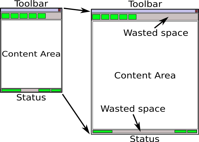
The problem stems from the fact that all GUI toolkits are coordinate-based. The buttons and text have fixed sizes. So although the document area will actually increase the toolbar and status bar will not. Empty space will be wasted in several parts of the window. See the following figure:
Toolkit programmers know this and have provided application developers will several facilities in order to control where this extra space goes. The buzzwords are containers/boxes/glue space/autofill/constraints e.t.c. Most developers either don't use these and just hardcode their user interface, or even if they use them they are never actually happy about the behavior of the application after resizing.
The truth is that all these methods are complex to use and understand. In any case the fact that not all elements of an application resize evenly when its window is maximized is problematic. Your latest application might look cool on your 19" LCD monitor with 1600x1200, but it looks ugly at your friends 17" LCD at 1024x768 and unusable at your aunt's 15" CRT and 800x600.
Edje allows you (if you want it of course) to give relative coordinates to all your interface elements. You can create a truly resolution independent application. You use Edje to describe the relative size and location of parts in your application. Each time the application window is resized all its elements will be also resized proportionally.
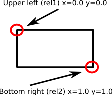
For each interface element you only need to describe its upper left and bottom right corner as it will appear in the application window. The figure below shows this. Let's say that your application is a "scroller" one which will show some content and will allow the user to go up and down by clicking arrows that reside on the sides of the window. You quickly draw two arrow images (one up and one down) in Inkscape and export them as .png images. Then you decide that you want each arrow to take 10% of bottom or top screen space.
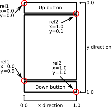
To tell Edje where a part of your interface resides you describe the relative coordinates of the top-left and bottom-right corners of the area it occupies on screen. Coordinates are normalized using the window size of your application (that is why they are called relative). So top-left corner of the whole window has x=0.0 and y=0.0 while bottom-right corner is at x=1.0 and y=1.0. Negative and greater than 1.0 values are actually valid ones. These describe elements outside of the viewable window and are well suited for animations (explained later). Next figure shows the relative coordinates of our example according to this approach.
This visual representation of the window content would be translated in Edje with the following code.
Example 4.1. Relative coordinates in Edje
part
{
	name, "up_button";
	type, IMAGE;
	description
	{
		state, "default" 0.0;
		rel1
		{
			relative, 0.0 0.0;
			offset, 0 0;
		}
		rel2
		{
			relative, 1.0 0.1;
			offset, 0 0;
		}
		image
		{
			normal, "up.png";
		}
	}
}
part
{
	name, "down_button";
	type, IMAGE;
	description
	{
		state, "default" 0.0;
		rel1
		{
			relative, 0.0 0.9;
			offset, 0 0;
		}
		rel2
		{
			relative, 1.0 1.0;
			offset, 0 0;
		}
		image
		{
			normal, "down.png";
		}
	}
}
The key point here is that the rel1 block corresponds to the top-left corner
of something while the rel2 is the bottom-right one. Take a moment to compare
this code with the image presented before. You should fully understand how the text describes the
interface and what do the float values (0.0 0.1 0.9 and 1.0) mean. Ignore the offset
lines. The name and type keywords are self explaining.
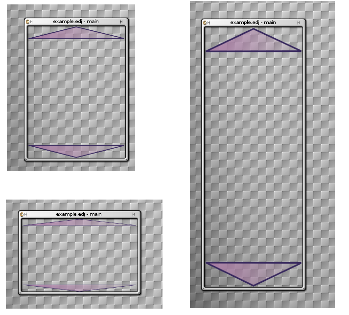
So what have we accomplished so far? Without writing a single C function we have a fully dynamic interface. Check the figure below. No matter how the user resizes the window, the interface will automatically "adapt" to its new size. Window coordinates? Screen coordinates? World coordinates? translation between them? No code for them at all needs to be written by the programmer. It is already in Edje (or rather Evas).
Of course a lot of people will probably step up and shout that this should only work if our graphics were vector based. This would make scaling images a lossless procedure and would always produce perfect quality visuals for the interface. If you read the Evas chapter you will already know what to answer to them. Evas/Edje has really sophisticated image resizing algorithms, so in most cases (provided that your image resources are reasonably sized) the loss in quality will never be evident to the end-user. And unlike vector graphics the Edje implementation is really fast.


